
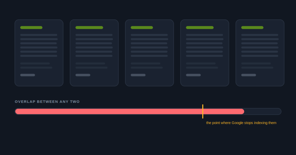
The number that matters is not your average. It is your worst pair.
I have measured chains whose average similarity looked acceptable at 51 percent and whose worst two pages sat at 94. The average was reassuring and completely useless, because Google does not evaluate your set as a mean. It looks at pages, finds two that are effectively the same document, and draws a conclusion about how the set was produced.
So before anything else: find your two most similar pages and read that number. Everything below assumes you have it.
Where the thresholds sit
Under 45 percent is healthy for pages covering the same kind of subject. Some overlap is unavoidable and appropriate: every store has hours, every store has a phone number, and the disclaimer at the bottom is identical by design.
Between 45 and 70 is the templated band. Nothing is broken, and nothing needs urgent action, but there is enough shared wording that somebody reviewing your site could reasonably describe it as one document produced repeatedly. That is a fair description at this level, and it is the level at which most chains sit without knowing it.
Above 70 is where I stop calling it a content quality issue and start calling it exposure. At that point the pages are the same document with different addresses, and that is the pattern that precedes a scaled content manual action.
These numbers are not published by Google and I want to be clear that I am not presenting them as policy. They are where the problems start appearing on accounts I have worked on, which is a different kind of evidence and a weaker one. Treat them as a way to prioritise, not as a line you can sit just underneath.
Why the score is worse than the pages look
This is the part that surprises people, and it is worth understanding before you argue with a number.
A similarity comparison strips the wrapper first. Header, navigation, hero band, sidebar, and footer come out, because those are identical everywhere by design and including them would make every page on every website look the same. What remains is body content.
On a dispensary site, body content is often much thinner than the page appears.
Two things make it thinner still. If your menu loads through an iframe or JavaScript, the products never reach the HTML and cannot count toward uniqueness. And if your reviews are a third party widget, those are shared markup too.
Strip all of that and a page that felt substantial in the browser can come down to an address, an opening hours table, and one paragraph of welcome copy. If that paragraph follows the same shape across your stores, your real overlap is close to total.
Why rewriting usually fails
Almost every chain I have worked with has already tried to fix this, and most of them tried the same way: they gave the pages to a writer and asked for them to be rewritten.
It rarely moves the number much, and the reason is worth sitting with.
Rewriting starts from the existing page. The writer reads what is there, changes the wording, improves the flow, and hands back something that reads better and says the same thing. The vocabulary is new. The substance is identical. A similarity check that works on meaningful word sequences sees straight through it, and so does a human reviewer.
Here is the test I use, and it costs nothing.
Take any paragraph and swap the city name for a different one of your stores. If the paragraph still makes complete sense, it is boilerplate. It does not matter how well written it is, how many synonyms it uses, or how recently it was rewritten.
“Visit our welcoming Ypsilanti store for a great selection and friendly staff” survives the swap. It is boilerplate. “Parking fills by six on Fridays, so use the Cross Street lot behind the building” does not survive the swap. It is unique.
The highest score I have measured on a live chain was 94 percent, between two stores in different states.
The team had genuinely rewritten those pages. Twice.
The problem was that both rewrites started from the same document, so the wording changed and the substance did not. Nobody had gone to the stores, or called the managers, or looked at anything the pages did not already contain.
What actually makes a location page unique
Facts you cannot invent from a desk. That is the whole principle, and once you accept it the work becomes obvious rather than creative.
1. Go and get the facts before anyone writes. One sheet per store: where customers park and what the situation is like on a Friday evening, which landmarks people navigate by, who has worked there for years and what they are known for, which products that branch sells differently from the others, what the delivery zone actually covers, and which neighbouring towns genuinely come to that store.
2. Write from the sheet, not from the existing page. Do not open the old page. This is the step people skip, and skipping it is why the rewrite failed last time. The old page is the thing you are trying to escape.
3. Run the swap test on every paragraph. Anything that survives a city swap either gets cut or gets replaced with something from the sheet. This is mechanical, it takes minutes, and it catches almost everything.
4. Fix the delivery too, or none of it counts. If your menu is invisible and your age gate is blocking the crawler, your beautifully specific new paragraphs will be the only thing Google can read, and there will not be enough of them.
The sheet is the real deliverable. Gathering it takes a week of phone calls for a twelve store chain, and after that the writing is fast, because the hard part of writing a location page was never the writing. What goes on that sheet, and the twelve minute intake that fills it in, is the part of the system worth copying.
Check it in about a minute
The location page similarity checker reads your sitemap, samples up to eight store pages, strips the navigation and footer, and reports the overlap between every pair so you can see your worst one rather than your average.
Why chains feel this and single stores do not
A single dispensary with one location page has no similarity problem, by definition. This is entirely a scale issue, and it gets worse in a specific, predictable way.
At two stores, nobody notices. At six, a pattern exists but nothing has gone wrong. At twenty, the template has been reused enough times that it is unmistakably a template. At fifty, you are carrying the pattern that scaled content actions were designed to find.
And the failure mode at scale is not gradual. A manual action applies to the pattern rather than to a page, so it takes every store on the same day, with no warning and no partial recovery. A chain does not lose ten percent of its visibility. It loses the map.
Do not spin the pages, and do not generate them.
Spinning produces pages that differ in vocabulary and match in substance, which is the same problem with more steps and a worse audit trail. Generating them from a template with variables produces the exact artefact the guidelines describe.
If you would be uncomfortable showing the process to a Google reviewer, that discomfort is the finding.
What to do this week
If your worst pair is above 70, stop publishing new location pages until the pattern is fixed. Adding more instances of a risky pattern while you remediate it is the most common way a remediation project fails.
If you are in the 45 to 70 band, you have time, and the sheet is the thing to start. It is not urgent, it will become urgent, and it is far cheaper to do while nobody is under pressure.
If you are under 45, check again after your next site build. This problem is almost always introduced by a redesign, when somebody sensibly decides to standardise the location pages.
If you take one thing away
Read your worst pair, not your average, and fix it by gathering facts rather than by rewriting sentences.